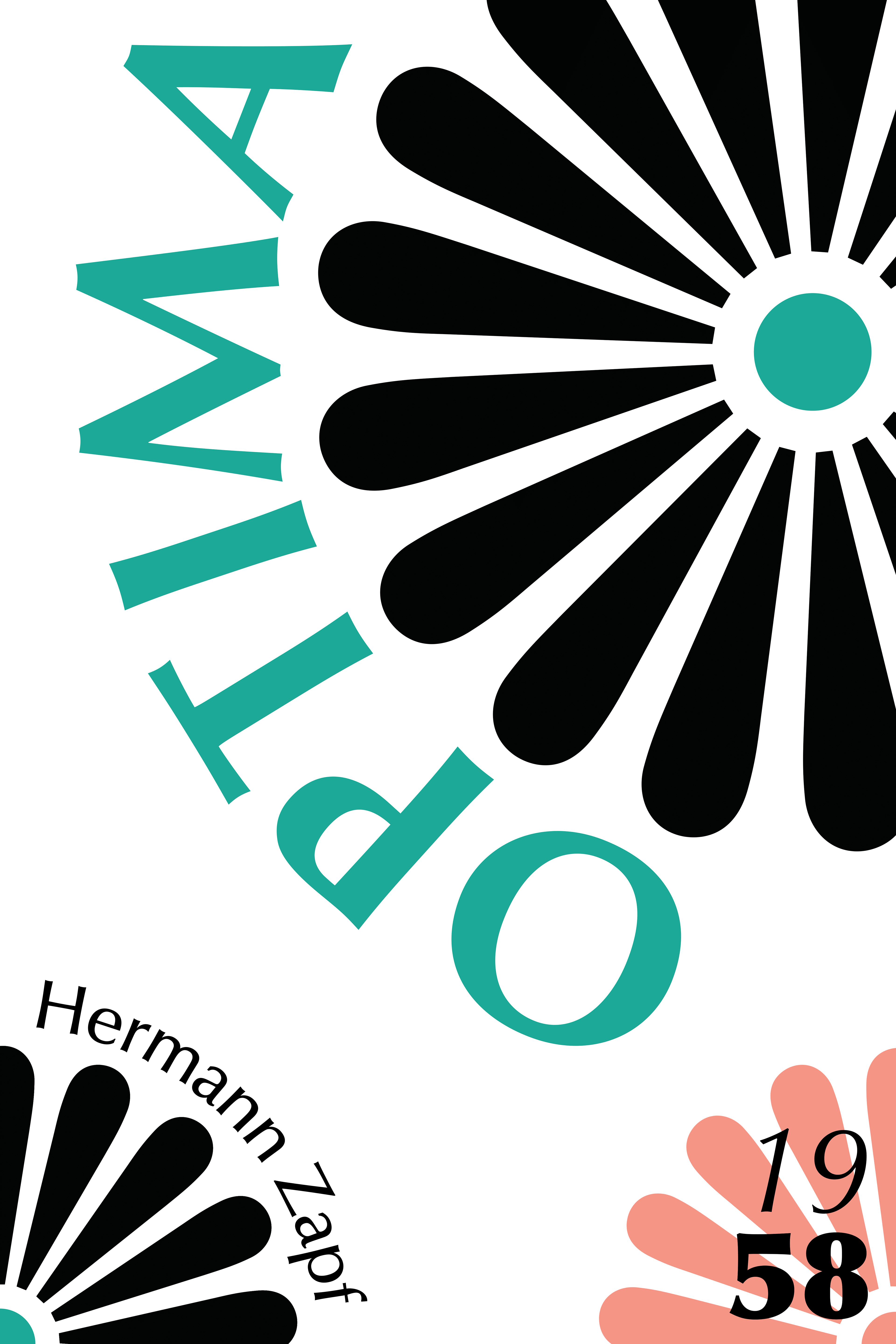


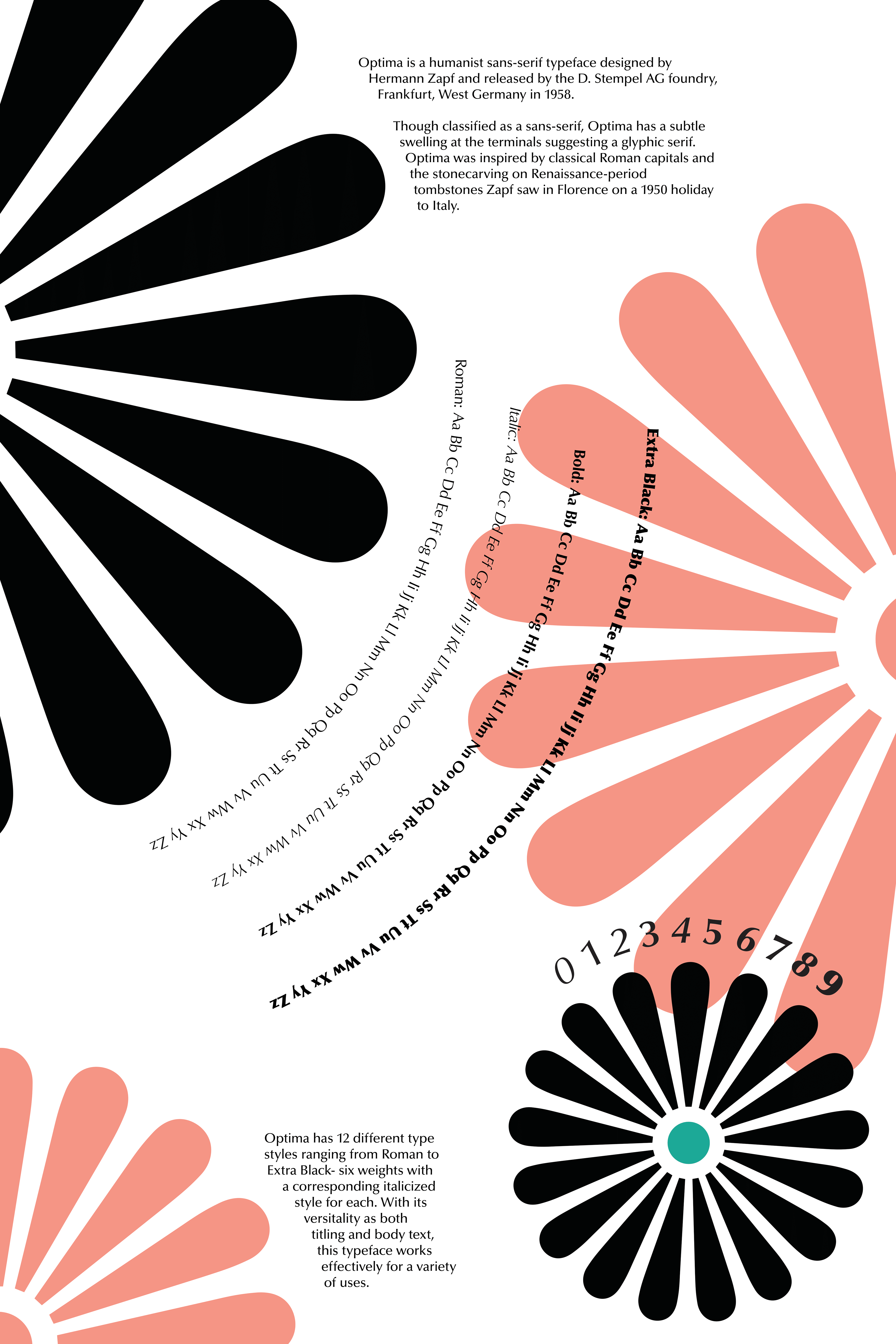
Using the visual elements of a selected typeface, this project aims to showcase its essence, the context behind its design, and an additional flower design to represent the soon-approaching 1960's. Incorporated are colors that are reminiscent of the sights of Florence, Italy, where German type designer Hermann Zapf vacationed and gathered his inspiration for designing Optima. The final composition consists of two posters designed to be displayed side by side as one cohesive piece.